Feb 12, 2019
Pick Your Palette for an Elegant Easter and Celebrate the Reason for the Season
Hey, crafty friends! How much did you enjoy all of the inspiration from last weeks February release? There were so many wonderful projects from the Taylored Expressions Creative Team using the new products and I was so inspired by them all! I am excited to delve a little deeper with a few of the projects from the new release (and a few other projects too) as we explore projects with a more elegant feel for the Easter season.
One of the ways to add a certain feel to your projects is with the colors or combinations of colors that you use. Color attracts attention to your project, sets the mood, and influences emotion. Sometimes, it’s hard to know where to start when choosing colors to use for different types of projects and so we are going to go right to the source. Let’s take a look at some of the beautiful, elegant Easter projects that have been created by the TE Creative Team and look at the color combinations that they used.
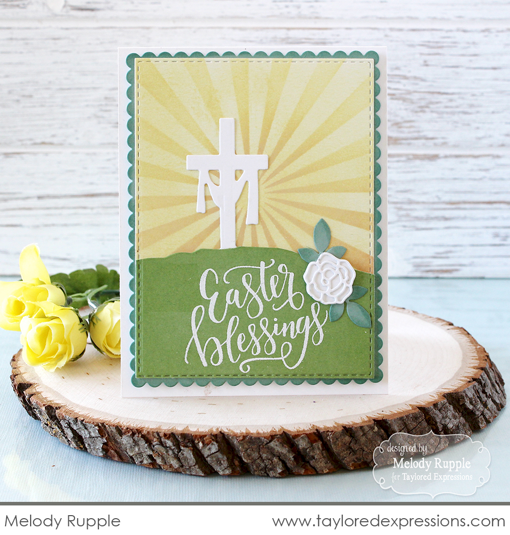
Let’s start off with this elegant Easter card by Melody Rupple created with the newly released Third Day Border die and Handlettered – Easter stamp set. Her color combination is fresh and bright, but muted just enough for a soft and elegant feel. I love the white silhouette of the cross image and the tone on tone inking on her background with the Here Comes the Sun stencil.
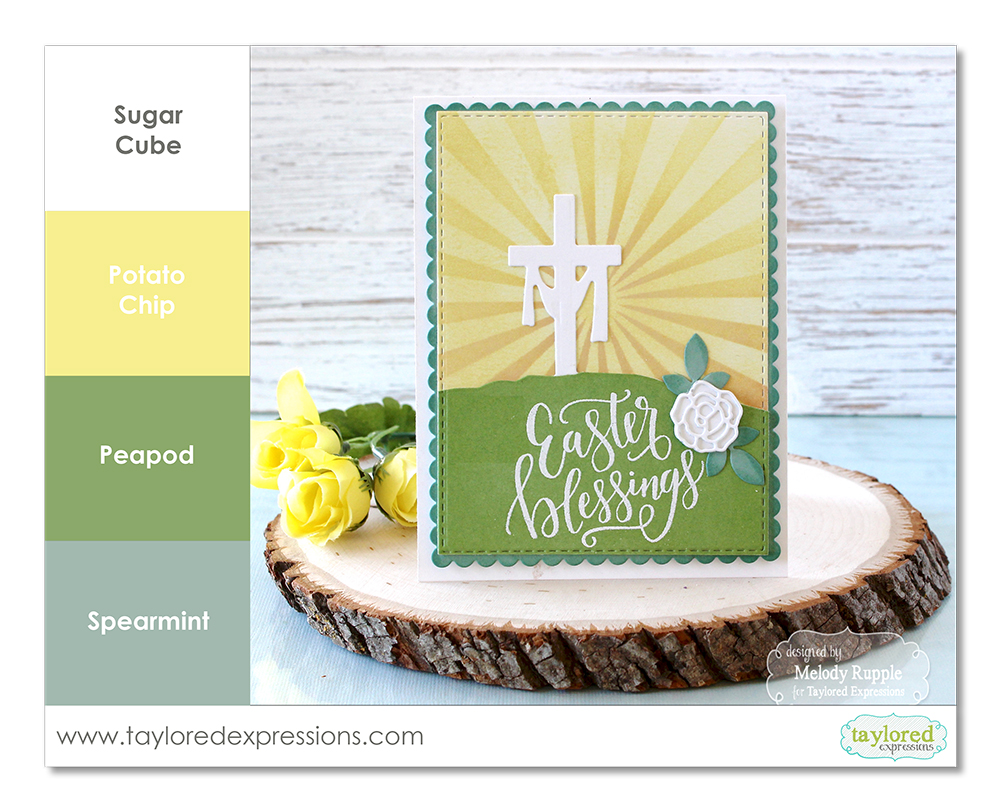
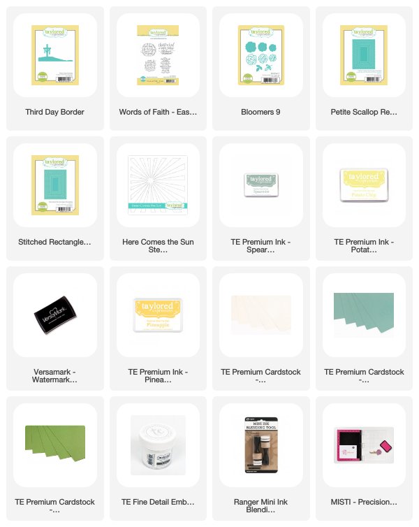
Melody’s color combination for this project uses Sugar Cube, Potato Chip, Peapod, and the new Spearmint colors. I love when combinations are used, like this one, that I wouldn’t have necessarily have put together myself. I am inspired to try it out on a future project!
I will have color combination recipe cards to share for all of the main featured projects I am sharing with you this week and when you stop back for the post this Saturday, there will be a PDF that includes the 4 feature project color combinations that you can download and print at home. Or, you can save the color combination graphics individually from each of the posts (just left click with your mouse and you should see an option to save the image.)
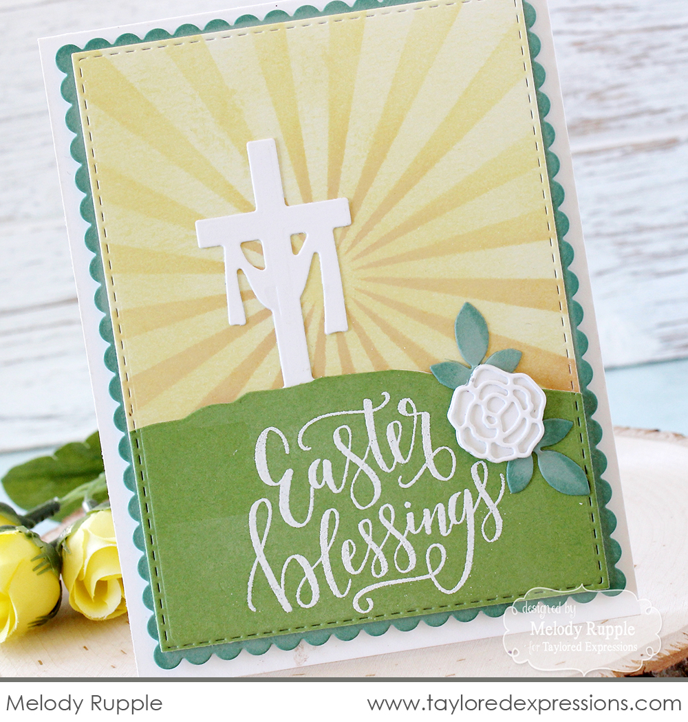
A few other details that add elegance to this card by Melody: the hand lettered sentiment embossed in white, the tiny scalloped border, and the beautiful white die cut rose embellishment.

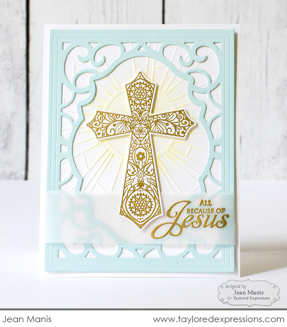
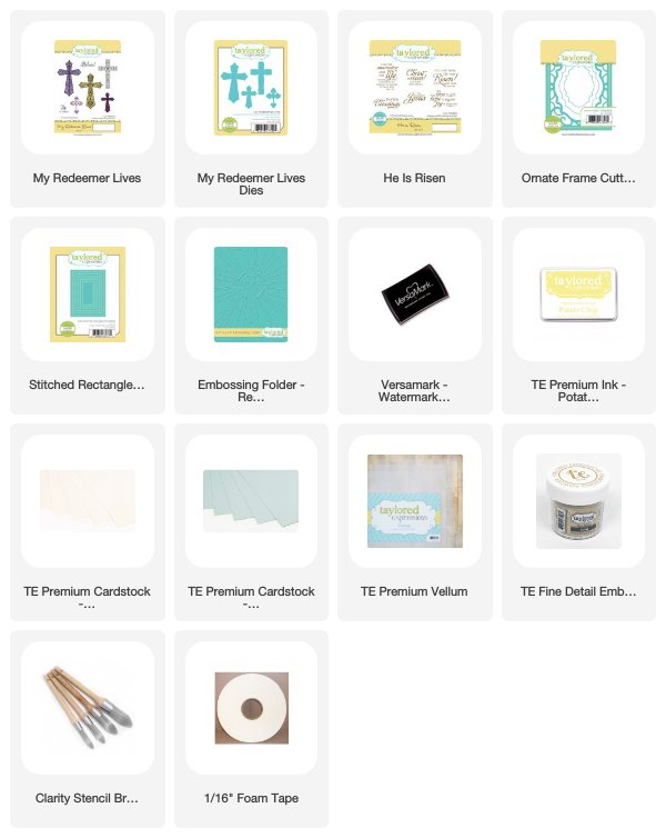
Another elegant Easter project that features a beautiful cross image is this card created by designer Jean Manis. Soft, pastel colors are a definite go-to for an elegant look as well as using metallics for details. Jean used gold embossing on her project for the main image and sentiment. I also love the elegant frame she used that was die cut with the Ornate Frame Cutting Plate die. The color combination for this project includes Sugar Cube, Salt Water Taffy, Potato Chip, and metallic gold.

We are just getting started with picking your palette for creating elegant Easter projects! Tomorrow, I have more inspiration to share with projects that includes using floral images and watercolor. Stop back again to see the featured color combination!
Did you know that you can subscribe to our blog and get our posts right in your inbox? Just sign up right HERE – that’s all there is to it to make sure you don’t miss any of our crafty inspiration!
