

Sep 19, 2026
Sneak Peek: Fall Color and Cozy Vibes Are Coming!
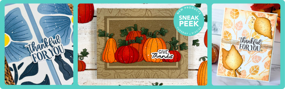
There’s a certain kind of creativity that comes with fall. 🍂 Rich oranges come back into rotation. Warm neutrals suddenly feel just right. Leaves, pumpkins, and beautiful botanicals find their way onto the craft table, ready to become cards filled with gratitude, encouragement, and connection.
On Tuesday, September 22 at 9 AM CT, our new Autumn Splendor release will bring all of that seasonal inspiration together!
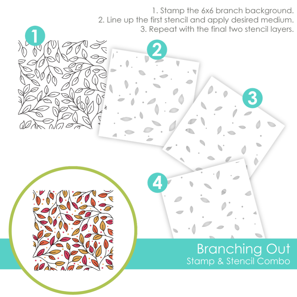
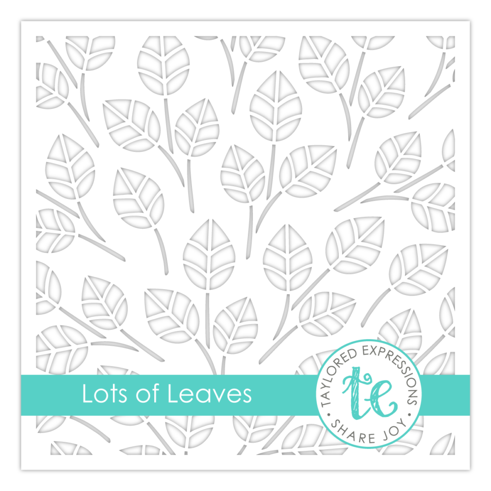
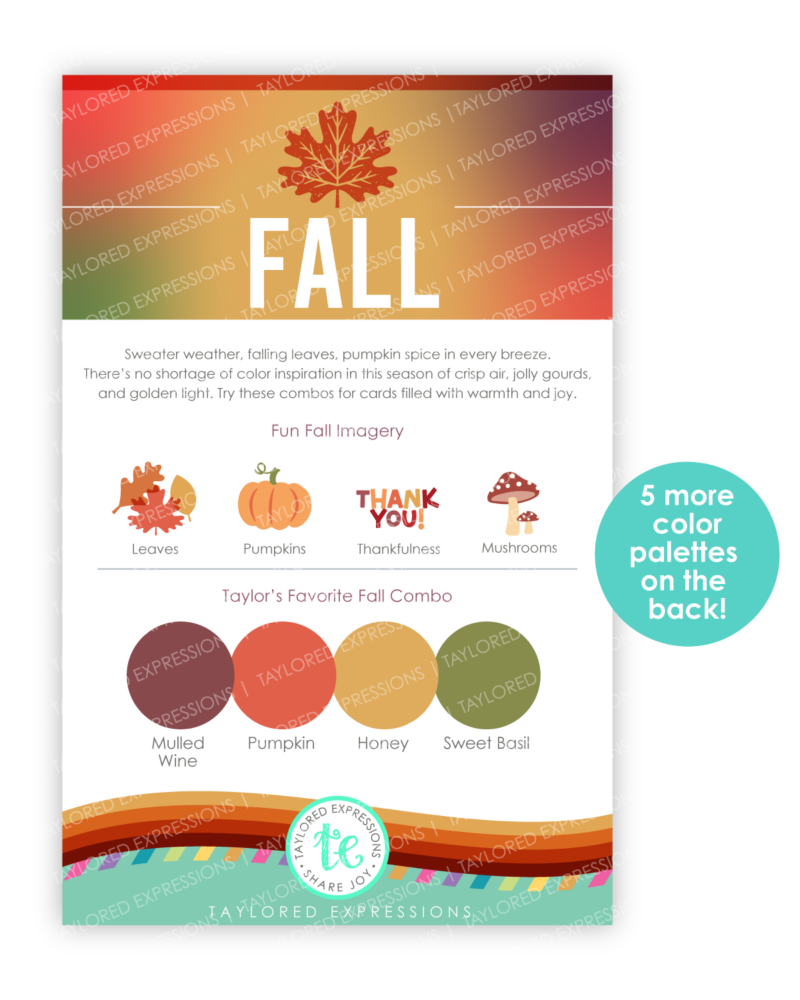
Whether you love building colorful scenes, creating backgrounds with lots of leafy detail, or simply need a little help finding the perfect fall color combination, there will be something waiting to inspire your next card.
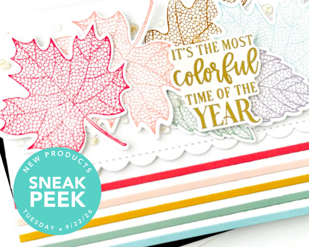
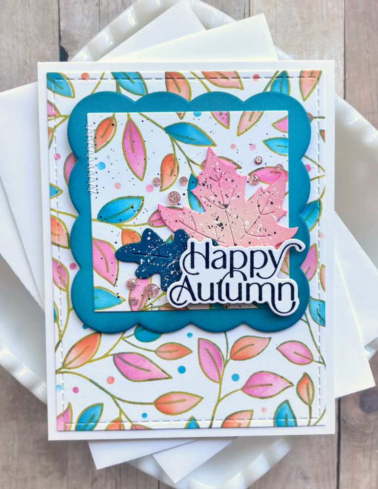
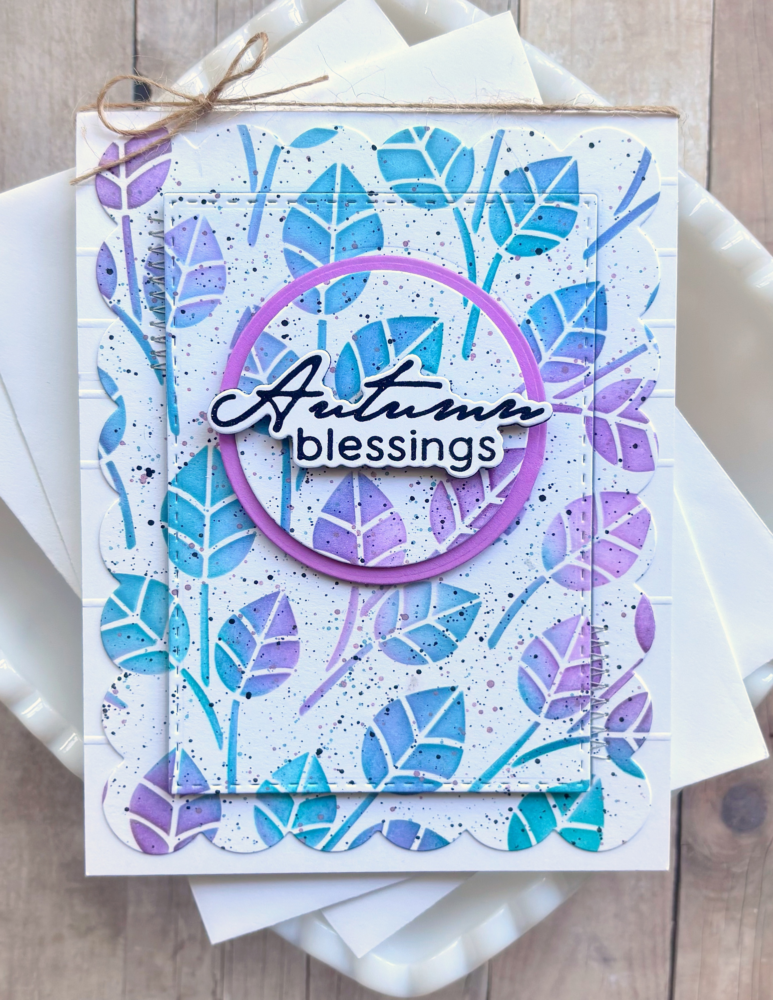
And Don’t Forget the Inside! 💌
The front of your card may get all the crafty attention, but what you share inside is where the connection really happens.
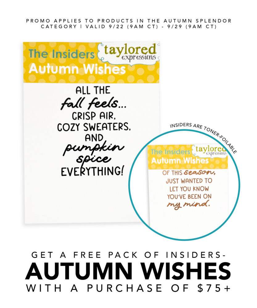
When Autumn Splendor launches, TE Exclusive – The Insiders – Autumn Wishes will feature six warm and playful messages designed to finish your fall cards with just the right words.
And we’ll have a special way for you to add them to your crafty stash!
Receive The Insiders – Autumn Wishes FREE with any $75+ purchase from the Autumn Splendor category. You’ll receive 12 pre-printed panels, two each of six designs, ready to trim, layer, and add inside your cards.
Press Play: Your Release Reveal
Crisp colors, cozy details, and all the things we love about fall are coming your way! 🍁
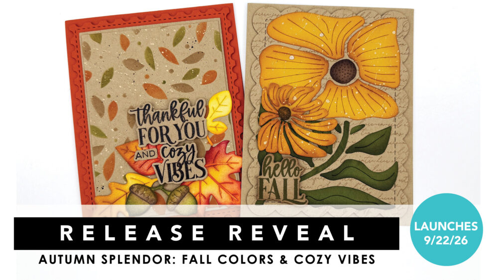
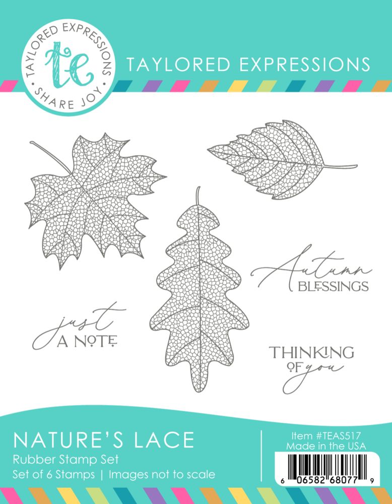
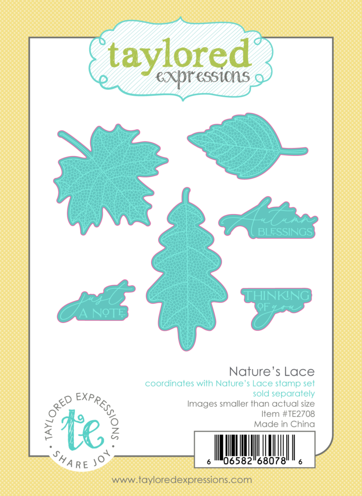
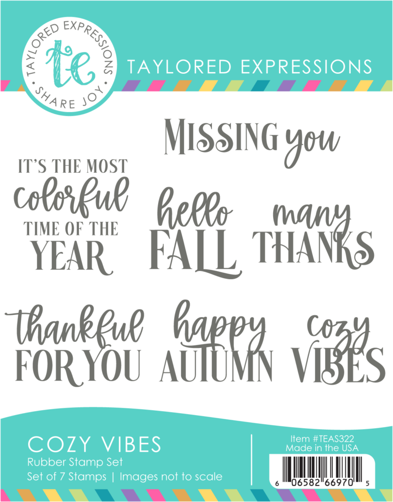
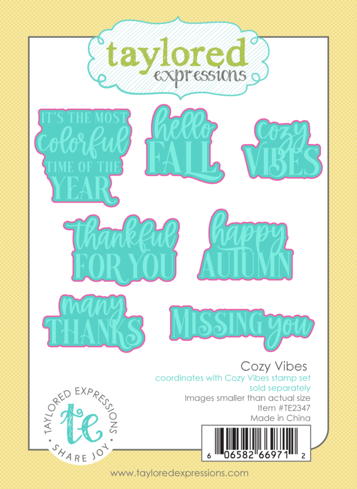
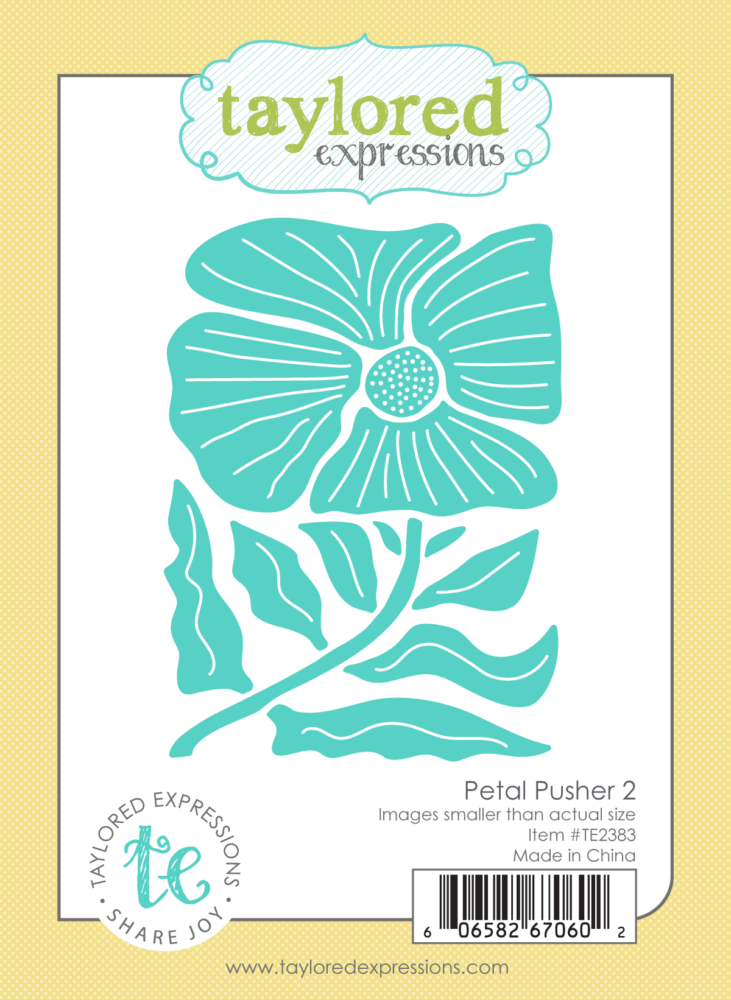
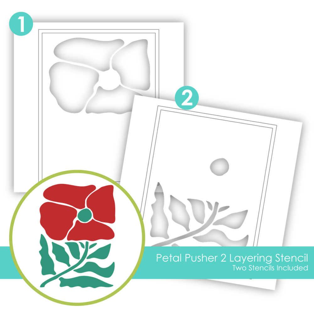
Join us for the Autumn Splendor Release Reveal as we give you your first look at a collection filled with gorgeous fall florals, playful pumpkins, layered leaves, warm sentiments, and plenty of creative possibilities. We’ll walk through the new products, share cardmaking inspiration, and get those fall crafty ideas flowing!
Then mark your calendar: Autumn Splendor launches Tuesday, September 22 at 9 AM CT!
See the Products!
Subscribe to the TE Newsletter!
Be sure you’re subscribed to our newsletter so all the details land right in your inbox on Tuesday morning. We can’t wait to share this release with you!