Oct 28, 2015
Blog Design Team: Ever heard of ‘Warehouse Chic’?
It’s already Wednesday, crafty friends! Are you already dreaming of the weekend? Hoping for some good treats? Before you get there, we have a fabulous card to share with you from Blog Team Member Amy Sheffer.
When we first saw this card, we tried to describe it and someone came up with the perfect phrase: warehouse chic. You’ll see what we mean when you check out her card below…
.gif)
And now, here’s Amy to tell us all about her project…
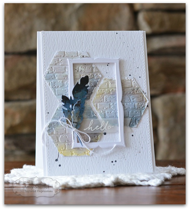
I love trying out artsy techniques on my cards, but I also really love a
clean look with lots of white space. The two don’t have to be mutually
exclusive. The key is to concentrate the messier technique into a
single area or cluster of elements, leaving the rest of the card more
open and clean. (We’ve dubbed this style ‘warehouse chic’!) The Hexagon Stacklets are perfect for creating fun,
small canvases for exploring techniques. I die-cut my hexagons out of
watercolor paper first, and then colored. This is a great way to explore
different watercolor mediums and/or color combinations on a smaller
scale. And if something doesn’t turn out, you can easily start over on a
new hexagon without feeling guilty that you’ve wasted a whole
watercolor panel.I used a combination of Scattered Straw, Wild
Honey, Weathered Wood, Stormy Sky, Faded Jeans and Pumice Stone Distress
Inks to watercolor the hexagons. Once dry, I ran the hexagons through
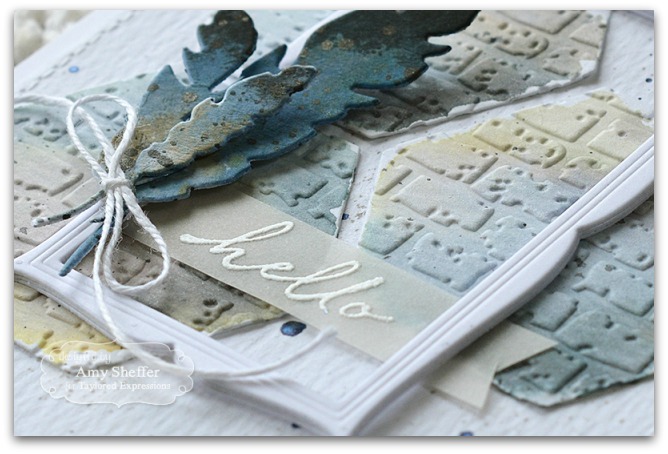
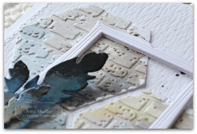
the Brick Embossing Folder for some great texture.I arranged the
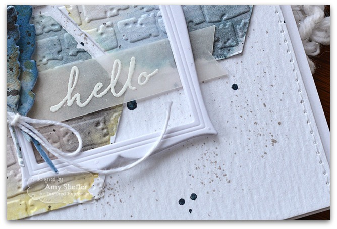
hexagons onto a lightly splattered watercolor background panel, then
added a Sugar Cube frame that I made by stacking three Frame in Frame
die-cuts.For the feathers, I first sponged them with Faded Jeans
Distress Ink. Next, I pressed Black Soot and Brushed Corduroy Distress
Inks onto a craft sheet, then pressed my feathers into the ink to add
the black tips and the brown speckles, very much like the ink ‘smooshing’
technique but without using any water. The sentiment, from Simply
Stamped – Zinnias, is stamped onto a strip of vellum in VersaMark, then
heat embossed in white.To tone down the contrast between
the white background and the artsy/messy hexagons, I added a light
splattering of navy ink, along with some fine gray splatter done with a
Pumice Stone Distress marker and a Distress Marker spritzer tool.And there you go — a little bit messy and a little bit clean!

Thank you, Amy, for sharing this ultra cool card with us today. You can find more of Amy’s beautiful work on her blog, Pickled Paper Designs. Have a joyful day!