Jun 02, 2016
You Look Great in RED…and ORANGE…and BLUE…
Happy Thursday, crafty friends! We have been having so much fun this week celebrating our brand new Premium Matched Ink! If you missed Taylor’s big announcement on Tuesday, be sure to check it out HERE. She’ll tell you all about our awesome new ink and if you want more inky inspiration, visit yesterday’s post HERE. We’ve been sharing projects from our inimitable Creative Team along with some special appearances from a few uber-talented Guest Designers! Plus, we’ve got some SPECIALS and a Giveaway! Read on for all the details…
Let’s kick things off today with special Guest Designer Debbie Olson! We are so thrilled to have Debbie join us today.

A note from Debbie…
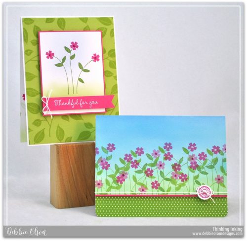
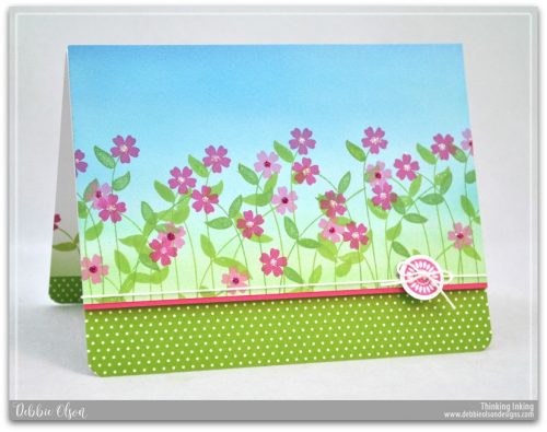
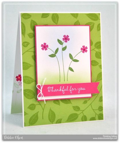
I loved the little stems and leaves in the Friendship Blooms stamp set, and I wanted to play with a repeating pattern, like a field of wildflowers. I used my Copic Airbrush System to create some ground and sky, but you could also use pretty much any kind of ink that you are able to sponge on easily. If you sponge ink on, I think I would do the background first, and then stamp the flowers. I used a button stamp from Friendship Blooms as my only accessory, punching two 1/16″ holes in it so that I could run my cotton thread through the holes like a real button. On the inside, I repeated the field of flowers, but left the sky light so that the sentiment would show up.
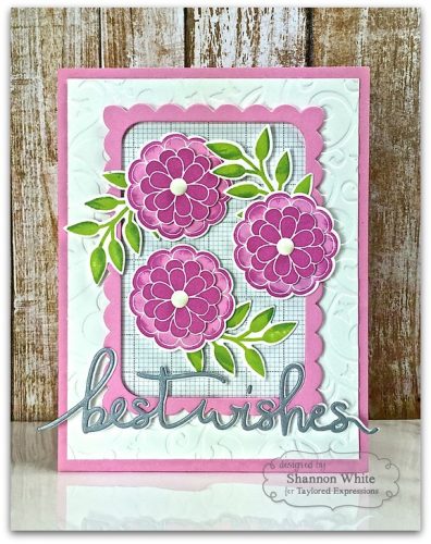
For my second card, I chose the large leaf stamp to create a background, stamping tone-on-tone with Granny Smith ink. I kept my focal image simple, stamping the stamps and leaves in Peapod, and the flowers in Lollipop. I airbrushed a hint of sky and grass just to add some interest, but kept those tones light. I heat-embossed my sentiment on the card front with detail white embossing powder and used foam tape to pop both the focal image and the banner up.
Debbie has created two gorgeously stamped cards and we just adore them both! Thank you so much, Debbie, for sharing your projects with us today.
          |

I chose the Happily Ever After stamps for my projects today and oh my gosh, I am so in love! The coverage is great and the ink dries perfectly to match TE’s Premium Cardstock as well! I thought I’d try to add a little two-tone affect here and there by inking the edges of my already inked stamps with a shade darker. The ink blended so well to achieve this pretty and easy to do look!
Love both of your happily ever cards, Shannon!
               |

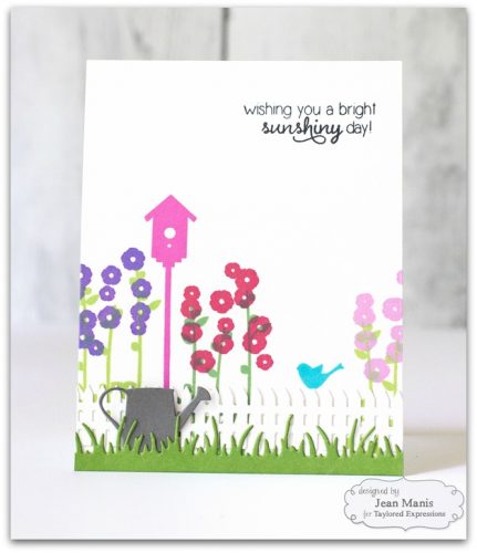
It’s easy to change up a stamped scene with just a couple of elements! For my two cards, featuring the same scene using stamps from the Lovely Landscapes set, the differences come in the finishing steps. I started my design with how I would stamp the flowers (two separate stamps for the blossoms and stems). I wanted to explore the Taylored Expressions ink palette by trying out both green inks (for the stems) and several of the colors for the blossoms. I loved the coverage of the ink, given that the ink of the flowers needed to partially cover the ink on the stems. To finish out the scene, I stamped the bird house and the bird with two other ink colors not used for the flowers. The ink colors perfectly coordinate with the Taylored Expressions cardstock making the selection of coordinating colors on one’s project a breeze!
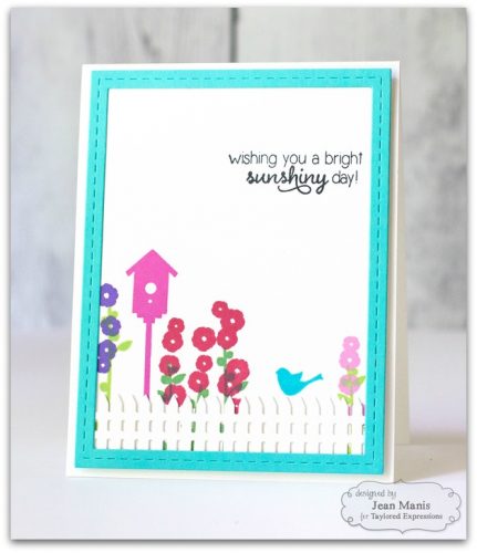
We absolutely adore both takes on the same stamp set, Jean! Thank you for showing how just a few tweaks can produce such wonderful results. We can’t choose our fave!
             |

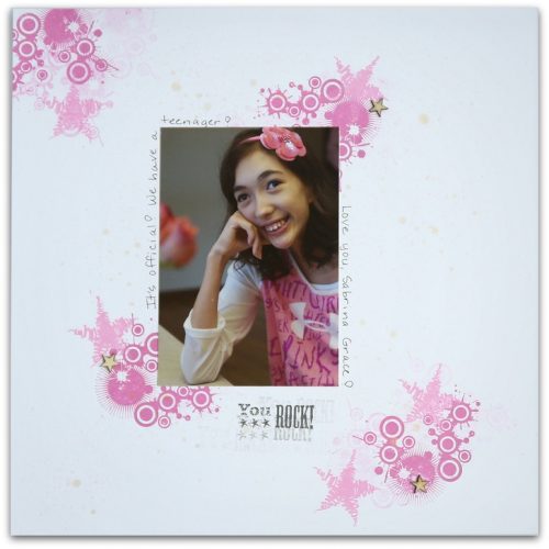
I was excited to try out the new Taylored Expressions premium ink pads, and I have not been disappointed! I used both Strawberry Milkshake and Lollipop dye inks on my layout featuring my pink-loving daughter. I was impressed with how well they stamped and how the colors remained vibrant! I know you’ll love them as much as I do!
  |

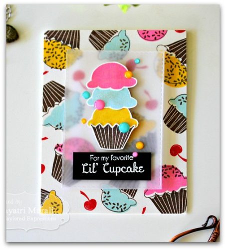
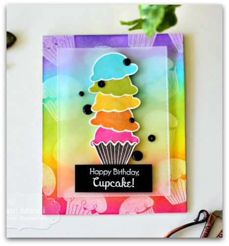
I wanted to try out the new TE inks in couple of ways: One by stamping the background using solid stamps to see if I would get crisp images and even coverage. These inks stamp blotchy to start with but as it dries, they even out to give fantastic coverage as you can see in my Lil’ Cupcake and Happy Birthday cards. The inks are bright, beautiful and are fade resistant. For the Happy Birthday Cupcake card, I wanted to see how well the inks blend by using the traditional emboss resist technique. I white heat embossed the cupcakes and sponged the new inks in rainbow order. I have used Jelly Donut, Cookie Monster, Granny Smith, Lemon Meringue, Candy Corn and Lollipop dye inks. I have also stamped the cupcakes with the same inks and layered them to coordinate with the background. Wink of Stella added shimmer and fun to the colors.
            |

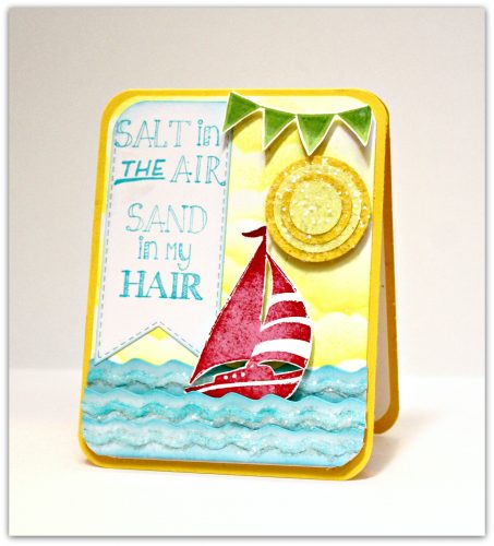
A note from Sankari…
I absolutely love the new TE inks! They stamp so smoothly and are full of rich color! It is almost like magic to then pair it with the coordinating cardstock to see how perfectly they align! Everything on this card (except the sun) was inked (the sky, the water, the boat and the sentiment). I am so looking forward to creating more coordinated cards with inks and matching cardstock and to creating more scenes with inked backgrounds.
Thank you so much, Sankari, for this fresh, summertime card!
         |
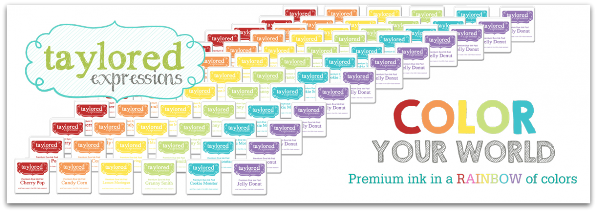
You can find all of the new inks colors HERE at the TE webstore!
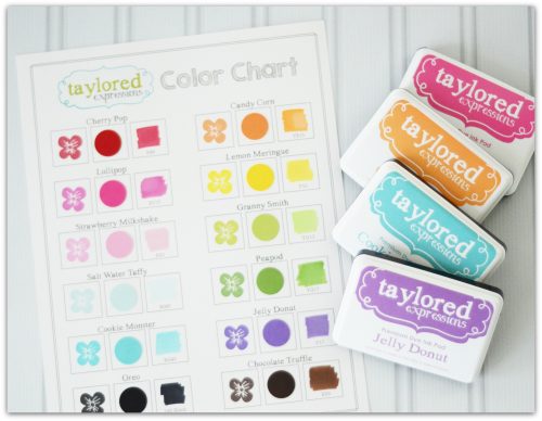
You’ll also want to add our free Color Chart download to your cart when you check out in the TE Store. It has boxes to stamp all 12 of our ink colors, include a swatch of the coordinating cardstock, and scribble a bit of the coordinating Copic marker.
Our special offers are only for orders placed May 31st – June 5th, and only while supplies last! Click here (or on the graphic below) for the details.
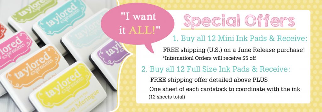
Now on to your chance to win 6 full size ink pads PLUS refills in the colors of your choice!

HOW TO ENTER: Leave a comment on this post for your chance to win full size ink pads and refills in 6 colors of your choice! We’d love to hear which color is your favorite! Stop back to the blog each day this week and leave a comment for extra chances to win. One comment per person, per day. Winner will be announced on Monday, June 6th.
Have a joyful day!