Feb 14, 2019
Pick Your Palette for an Elegant Easter with Hand Lettered Sentiments
Hey, crafty friends! Have you ever tried doing your own hand lettering? I have taken a couple of classes over the years, but definitely still need a bunch of practice to work on my hand lettering skills. My daughter, Hana, has been very into doing hand lettering. I took her to a class a couple years ago and ever since she has done lots of hand lettering on her hand made cards and in her journals. She’s always watching video tutorials and has quite the collection of markers, pens, and brushes. I, of course, love to enable her in this crafty endeavor!
I love the elegant look that hand lettering brings to a project and I love even more that there are stamps that easily enable me to add hand lettering to any of my projects! Today, I have a few elegant Easter projects to share from Jen and Jill from the TE Creative Team that feature hand lettering and more elegant color combinations to add to your inspiration file.
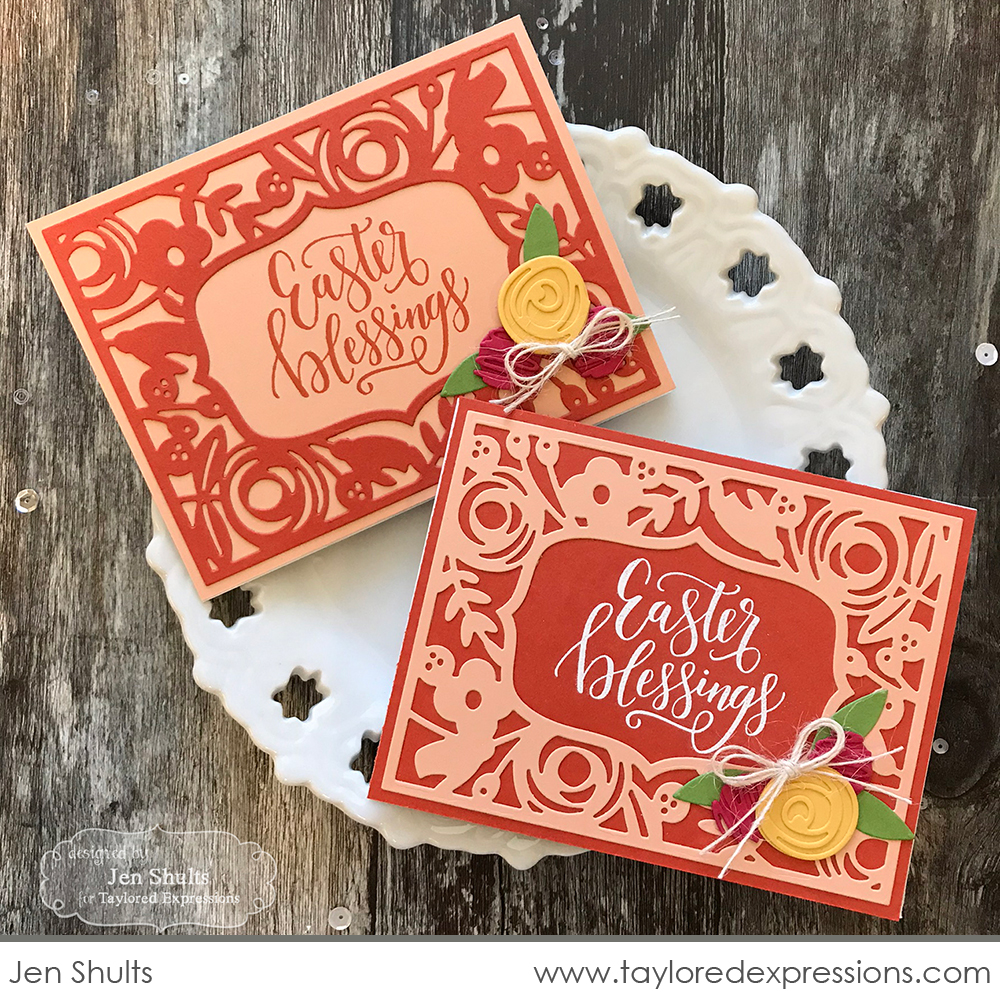
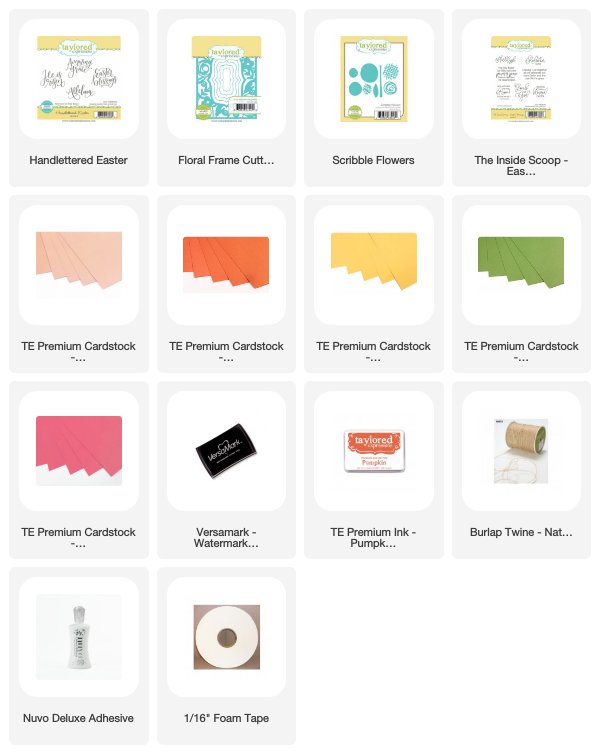
Jen Shults put together this lovely Easter card duo using the new Handlettered – Easter stamp set and framed it with the Floral Frame Cutting Plate die. The hand lettered sentiment really pairs well with the floral design in the frame with its elegant, yet playful feel. Her color combination is a bit bolder than the ones we have shared already this week and is also a bit more out of the box. I love how Jen flipped the colors with the two cards for a different, but still unified look between them.
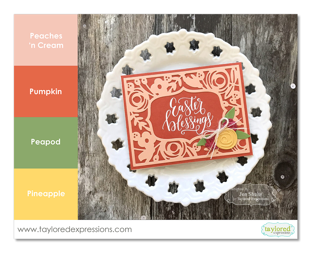
Jen used the new Peaches ‘n Cream color along with Pumpkin, Peapod, and Pineapple. The softer Peaches ‘n Cream color really tones down the 3 other bolder colors so they don’t overpower then card. The color combination evokes feelings of spring, but also brings an elegant feel to Jen’s project.
I will have color combination recipe cards to share for all of the main featured projects I am sharing with you this week and when you stop back for the post this Saturday, there will be a PDF that includes the 4 feature project color combinations that you can download and print at home. Or, you can save the color combination graphics individually from each of the posts (just left click with your mouse and you should see an option to save the image.)
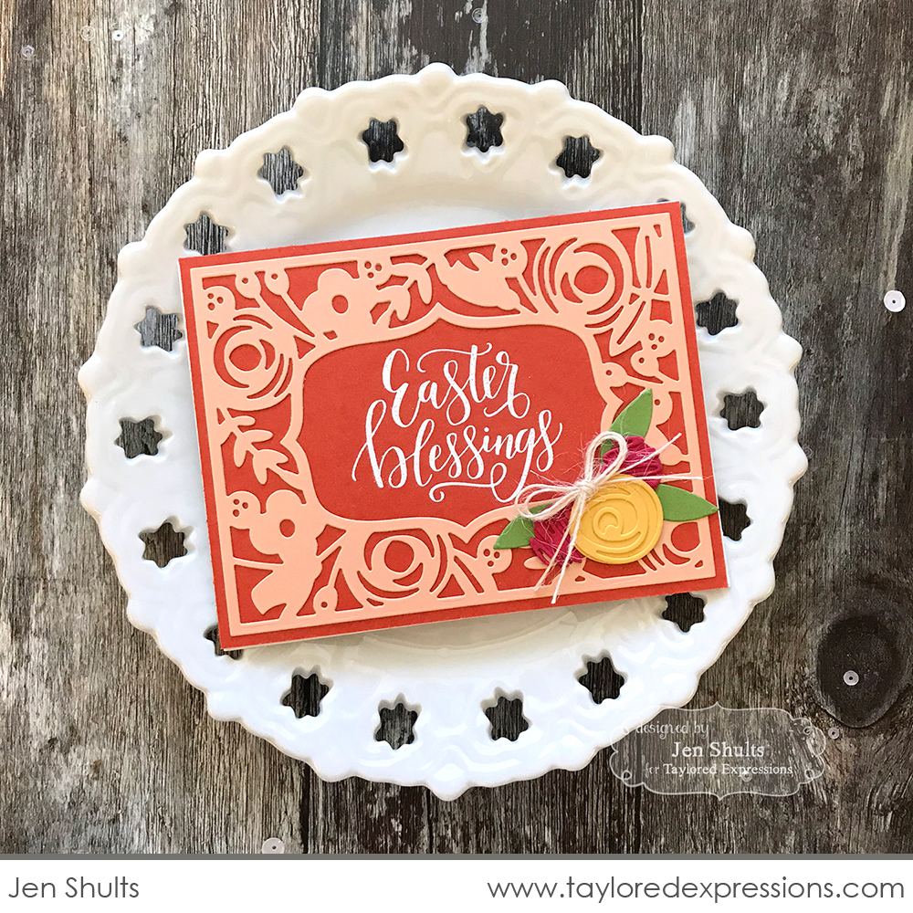
Here’s a closer look at one of the cards in the duo. Jen used a few other elements to bring elegance into her card design: the sentiment that is embossed in white, the die cut floral embellishment on the corner of the frame, and the tiny bow.
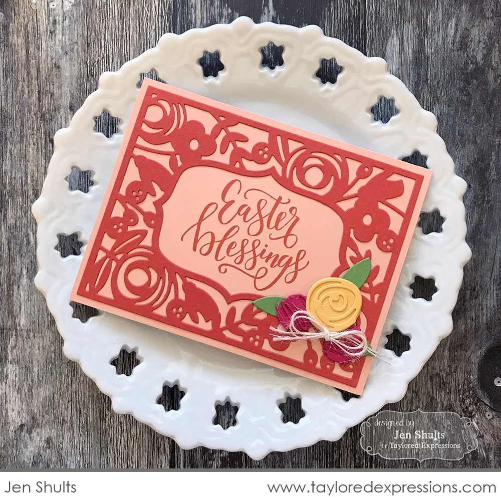
Floral images in general are perfect for a more elegant look and the frame opening in the center of the Floral Frame Cutting Plate die has a wonderfully elegant shape.

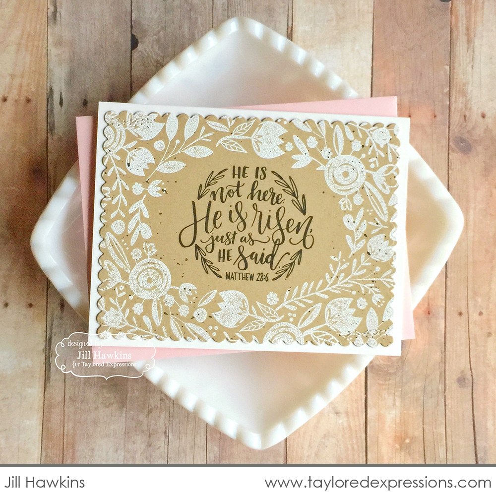
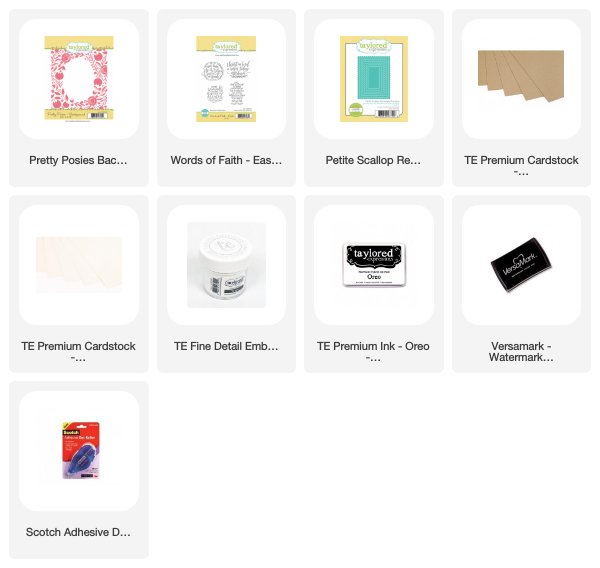
This Easter card by Jill Hawkins uses a pretty minimal and neutral palette. Sometimes keeping things simple is all you need for an elegant effect. Jill paired the new hand lettered Words of Faith – Easter stamp set with the new Pretty Posies Background stamp. She embossed the floral frame in white, which instantly adds an elegant look and feel. Small scallops are definitely on the list of elegant details and that is what the main stamped piece of the card is die cut out with. The color combination for this project includes Toffee, Sugar Cube, and Oreo .

I have more Elegant Easter color inspiration coming your way on Saturday, so I hope you will stop by again then. Along with more color inpiration, the projects I am sharing have some wonderful and elegant features that you will definitely want to recreate on a project in the near future!
Did you know that you can subscribe to our blog and get our posts right in your inbox? Just sign up right HERE – that’s all there is to it to make sure you don’t miss any of our crafty inspiration!


