Jun 27, 2018
Liquid Watercolor Week Day 3: Detail Painting

Hey there, crafty friends! Happy Hump Day! This week we’re exploring our new liquid watercolor and so far the blog has been packed full of amazing inspiration, tutorials, video content, and new products. If you’re just happening upon watercolor week today then make sure you check out previous posts and set a reminder to come back the rest of this week for more informative videos and gorgeous inspiration!

Today, Jean Manis is going to take us through her process of adding watercolor to several of our 3×4 Inspire watercolor panels. Each package of watercolor panels includes 12 designs pre-printed onto our 118 lb. watercolor cardstock just waiting for you to add color! Jean has lots of info to share (including dos and don’ts) so let’s get started!
Jean started by attaching the watercolor panel to a clipboard using Purple Tape. Taping the panel down before beginning a wet application, will keep the panel from warping as you work. And Purple Tape is a great option as it won’t rip your paper or leave residue behind. You can start by adding one drop of Guava liquid watercolor and one drop of water in a palette. Dip your brush into the liquid and apply the paint to the letters in the word “kind,” putting paint at the places in the letters where you want the most color. At this point, the watercolor panel was completely dry.

This method works fine if you have a lot of area to cover and can quickly add water with a damp brush to spread out the intense color; otherwise, the area is saturated with too much paint and may be dry before it can be easily blended. In this case, the 1:1 ratio of liquid watercolor to water was too concentrated for this first step in the process. If you find the color you’ve added is too concentrated, Jean suggests going over the concentrated area with a damp brush to spread out and remove some of the color before it dries completely. Tip: keep a scrap piece of watercolor cardstock nearby to test the strength of the watercolor mixture before applying to your panel.
As Jean continued to color the image, she used a more diluted mixture to color the heart.

In order to darken one area of the image, she applied a more concentrated mixture to that area and allowed the water to carry the color across the shape. Always keep a paper towel close at hand in order to quickly draw away some of the color and moisture.

Continue coloring the word ‘heart’ by first going over the letters with a damp brush and then applying a mixture of 1 drop of Blue Corn diluted with 2 drops of water. Blend out the color on the letters and then apply more concentrated color in the areas you wish to be more intense. Watercolor is a very free-flowing application and no two projects will ever turn out exactly the same. The beauty of watercolor comes from using some of these “best practices” and then experimenting yourself!

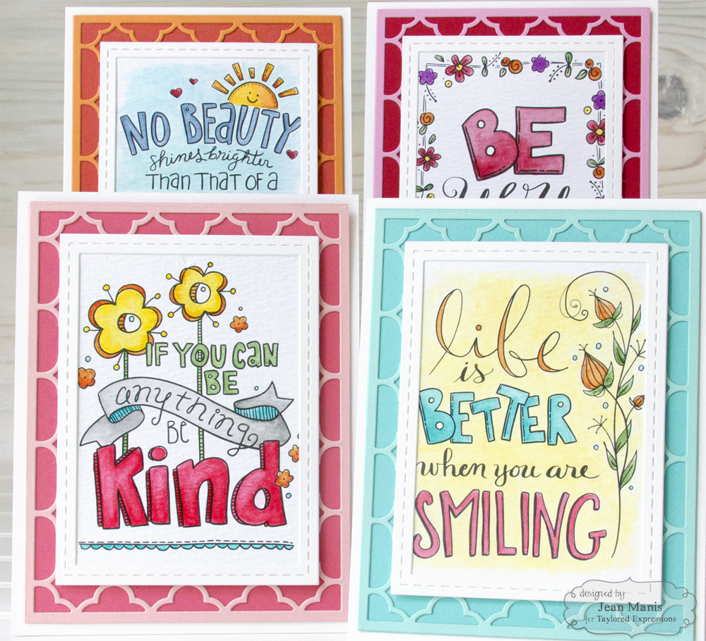
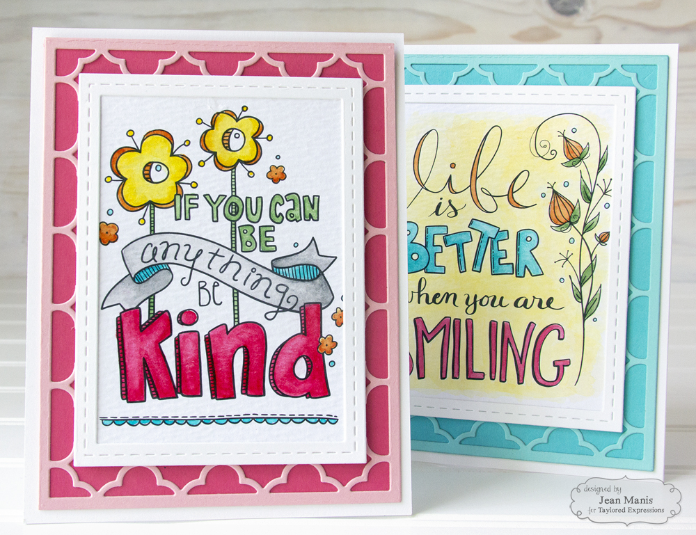
After watercoloring each panel, you can see how Jean turned these small panels into a set of beautiful notecards! The tone on tone background was created by layering the lighter color cut from the Quatrefoil Cutting Plate over a darker shade of the same color. Then simply frame the watercolor panel with a frame from the Stitched Frame Stacklets set and adhere it to a card base.


|


